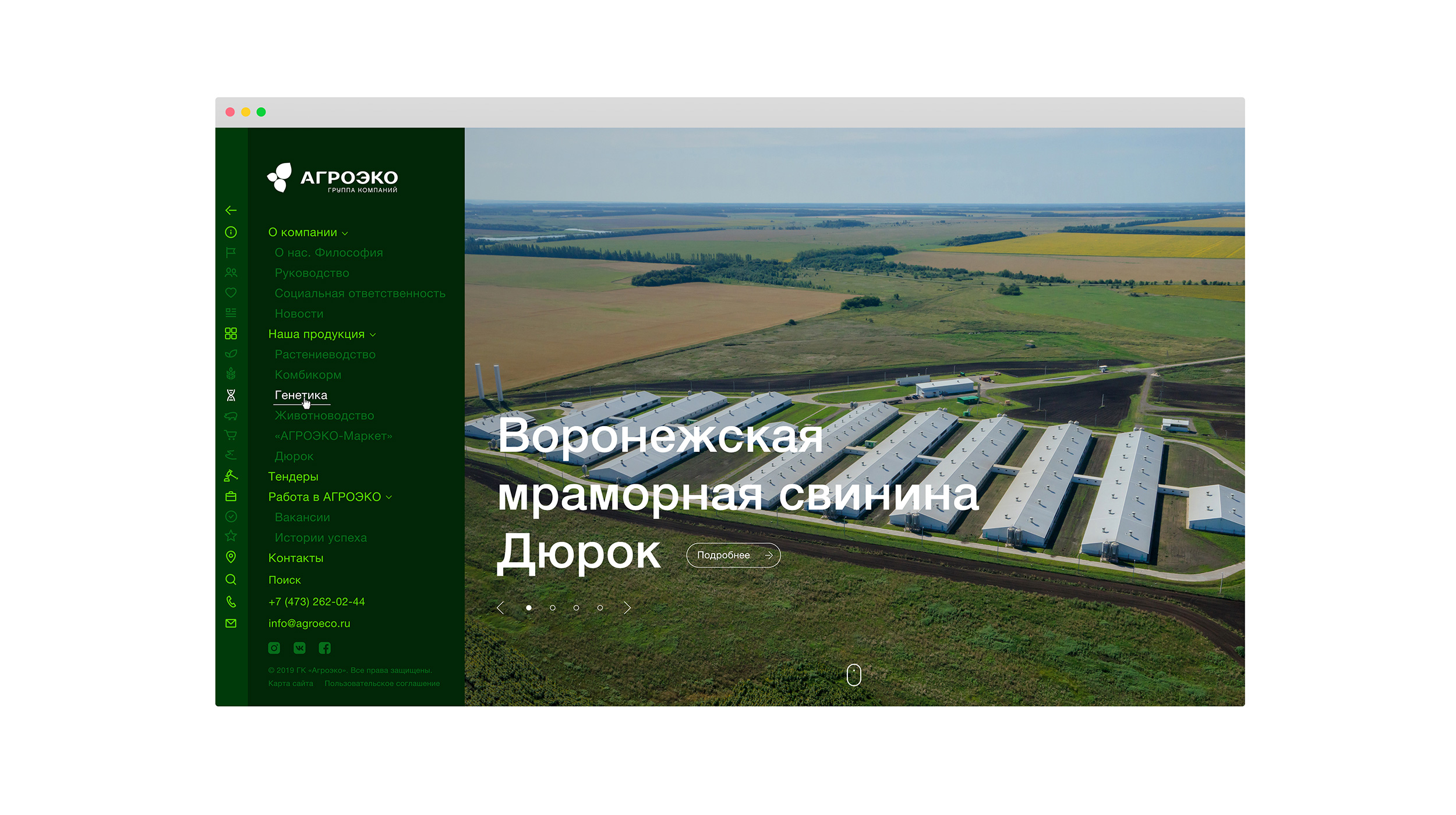
Agroeco
Group of companies Agroeco
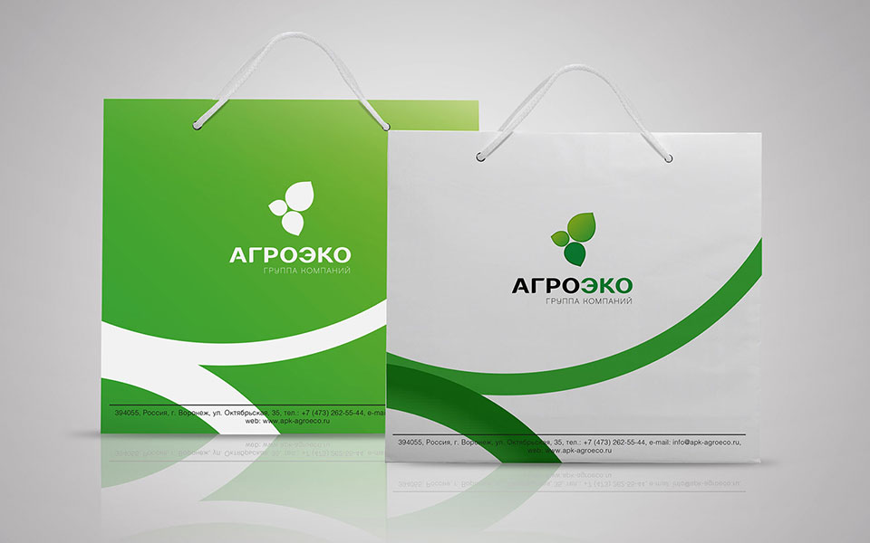
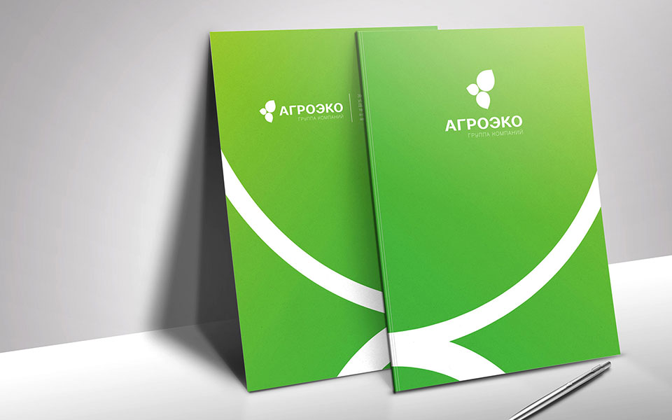
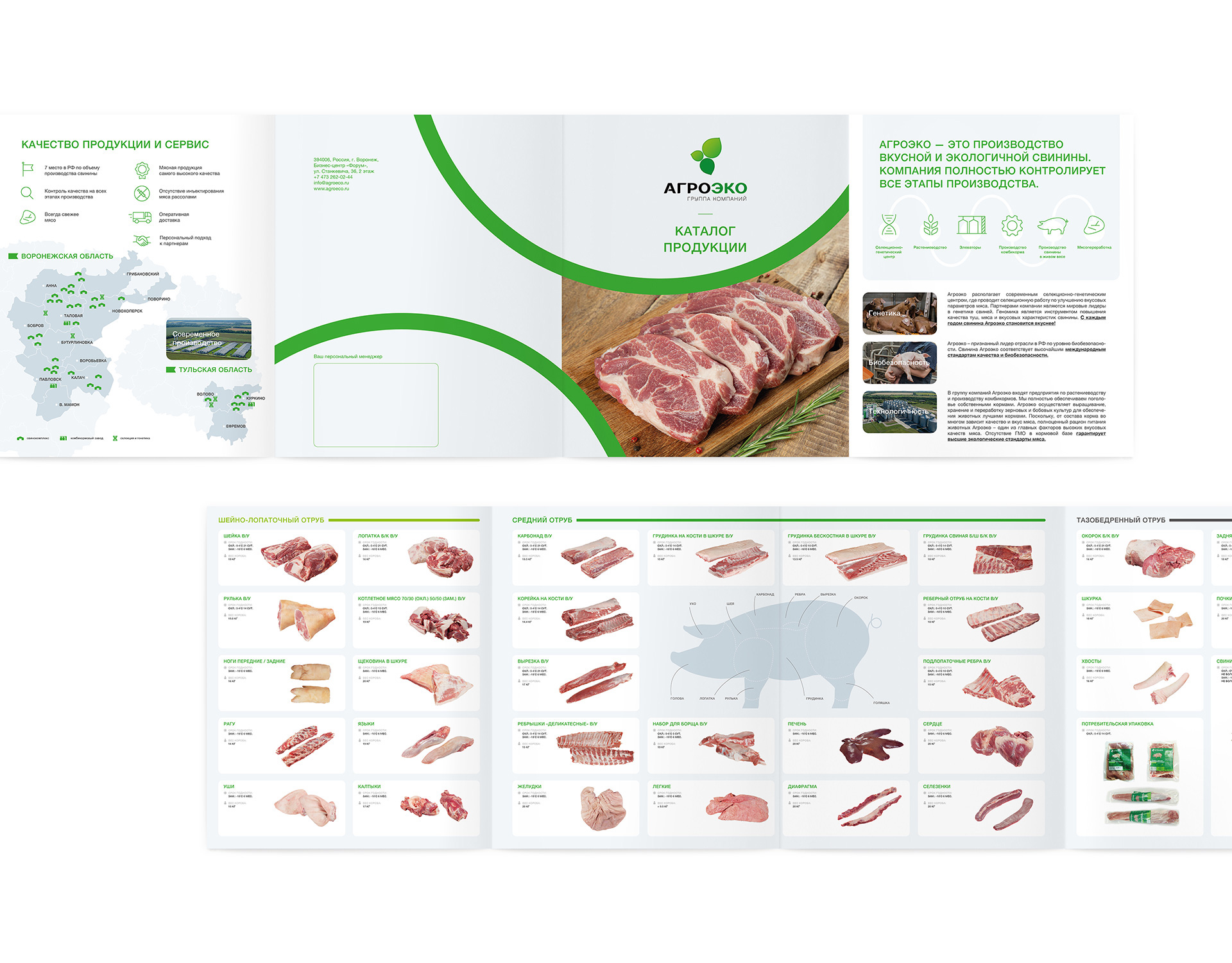
The logotype element is based on the silhouette of a pig’s ear. At the same time, the emphasis is placed on the ecological component: color (naturalness of the product, its useful properties) and shape (together 3 elements are assembled into an associative image of leaves). The logotype is memorable, evokes the trust and location of the consumer.
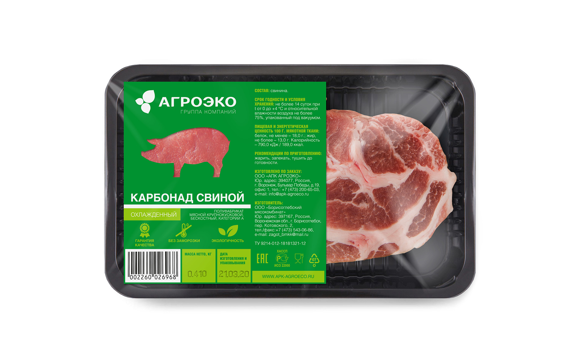
Logotype — Identity — Guidelines — Print design — Infographic — Packaging — Website
Russia, Voronezh
View guidelines →

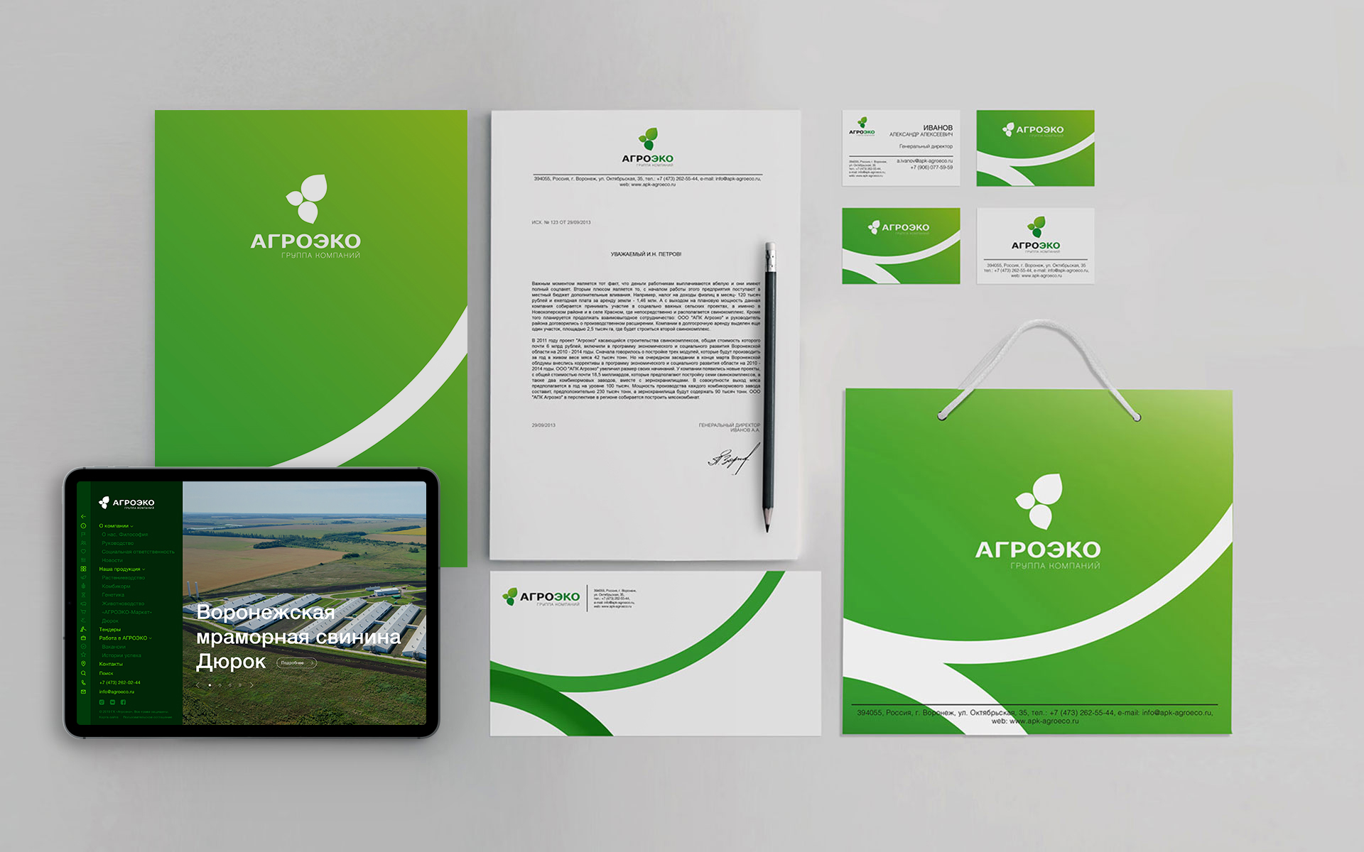
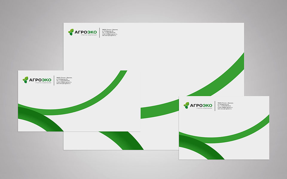
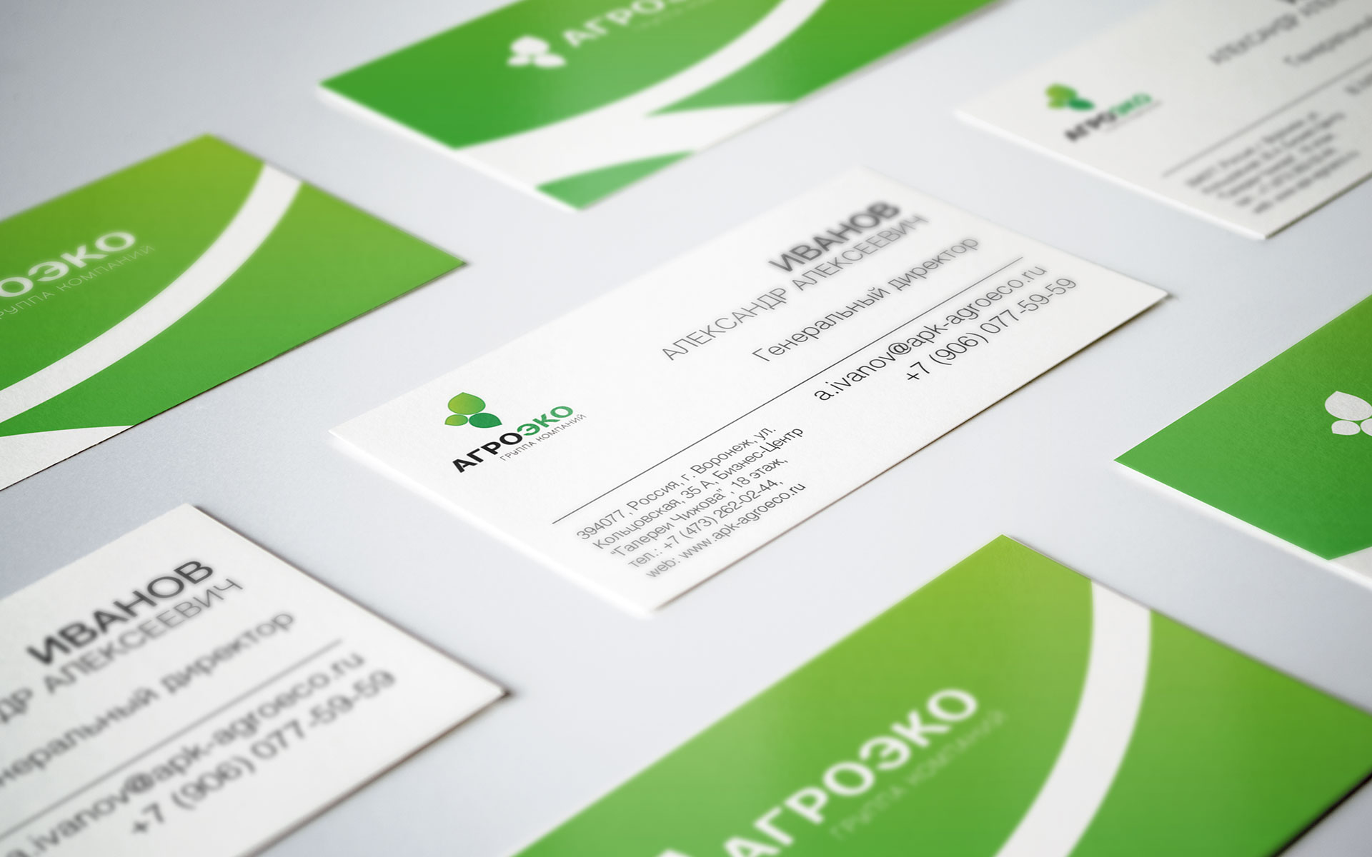
The corporate identity is based on additional graphics based on plastics and logotype stylistics, which conveniently scales to any proportions.