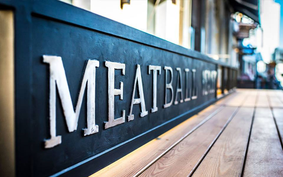
Meatball Heaven
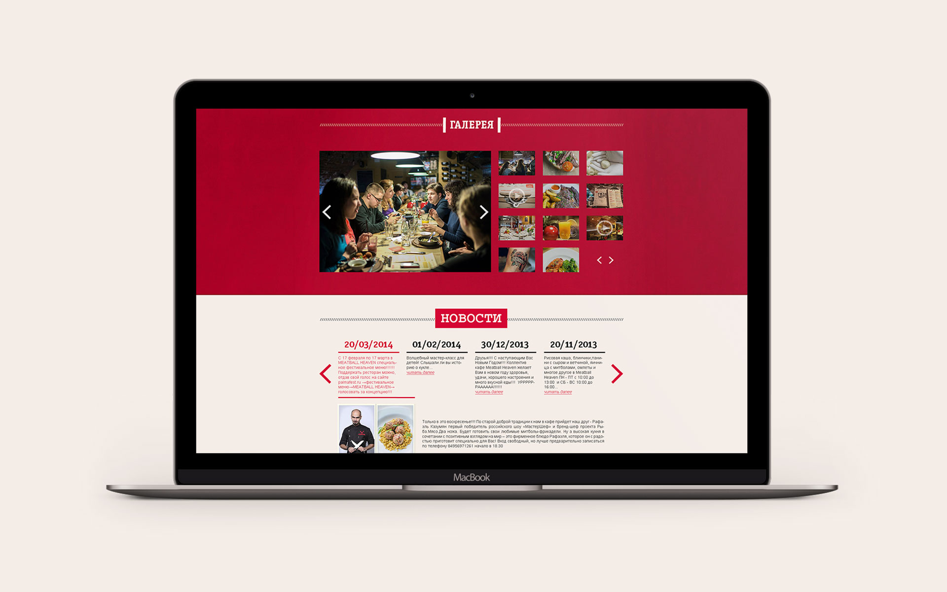
Restaurant Meatball Heaven
The concept is based on the interpretation of the “holy”, “heavenly” word in the logotype. The sign is a stylized image of the “holy” meatball with symbols of paradise: angel wings and a halo, made in the “freehand” drawing technique. The style of the meatball line emphasizes another meaning – it is the collected remains of the sauce from the plate, indicating how delicious the dishes are in the restaurant.
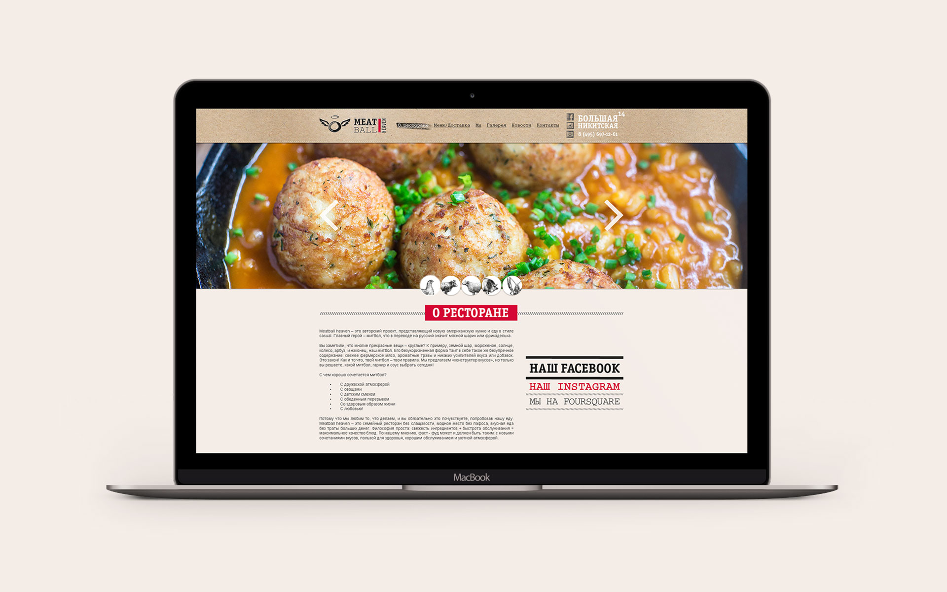
Logotype — Identity — Guidelines — Print design — Website
Russia, Moscow
View guidelines →


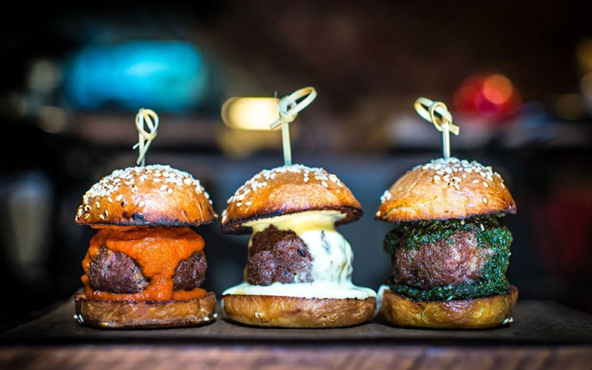
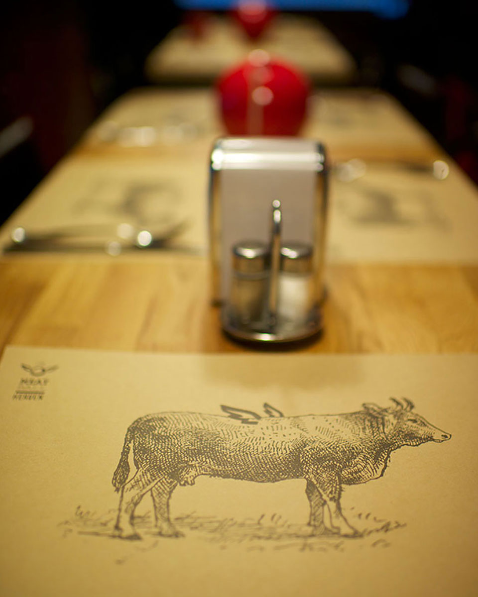
The corporate style plays on and emphasizes the richness and variety of ingredients from which meatball is made (their modularity in the restaurant menu): pork, beef, chicken, etc. The ingredients are realized through engraving images of the appropriate animals, which brand the advertising planes in a winning way, create a memorable associative array and complement the sign and logotype.